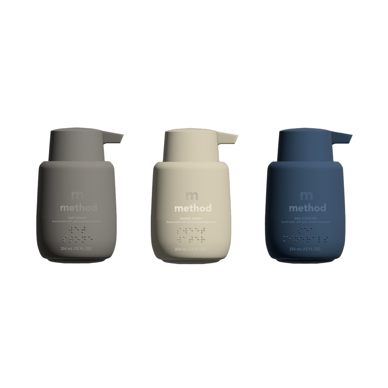
Method is a company known for their affordable, eco-friendly, aesthetically pleasing products. Since high school, I have been impressed and influenced by their design, the bottle shapes, colors, logo design, scents, everything about them! For a project in my Graphic Design 4 class, I wanted to design a new hand soap bottle design with a focus on being accessible to people who are visually impaired.
The bottle design was intentional - focusing on being sturdy, with a hidden weighted base to provide for stability. The pump is large with braille stamped to identify the product and specific scent, with a velvet matte texture finish.


